00:00:00
NY

Well design system

Rebuilding color to scale across platforms, teams, and accessibility needs

Unified product and brand color systems to reduce design debt, improve accessibility, and support consistent healthcare experiences.

Health Design system Product 2024

Context

Well is a digital-first health platform spanning product and marketing surfaces. As the company scaled, color decisions fragmented across teams, creating inconsistent UI, accessibility risk, and slower delivery.

This project reset the color system with a unified, token-driven foundation that preserved brand expression while making accessibility and cross-platform consistency the default.

I partnered with another design systems designer to define structure, validate contrast in production-like screens, and set documentation patterns teams could adopt incrementally.

The goal was not a visual refresh. It was a shared system language that helps design and engineering ship faster with fewer exceptions and fewer accessibility regressions.

0.1.0TL;DR

As Well scaled, color usage became fragmented across product, marketing, and illustration—creating inconsistent UI, accessibility issues, slower design decisions, and increased engineering complexity.

Today, we’ve established a unified, token-driven design system that balances brand expression with accessibility, giving designers and engineers a shared language to move faster together.

Less rethinking every screen

Common patterns are covered by modules and tokens, so designers spend less time re-negotiating color on each surface.

A clearer picture of progress

Per-platform dashboards show which components are token-clean and where legacy color still lives.

Room for intentional one-offs

Bespoke color is now an explicit category with simple rules, so marketing work can push without quietly breaking accessibility.

0.2.0 Introduction

I worked as a design systems designer (with Colleen) on a focused initiative to realign how Well uses color. As the product and brand evolved, the organization needed a more scalable approach—one that kept pace with a growing number of features and customer touchpoints without multiplying exceptions.

Our charge was to define a more cohesive structure for color, validate it for accessibility, and set up patterns that teams could adopt in stages without a costly rewrite.

Team 2 people

Jason (me) Design systems designer Colleen Senior design systems designer

Duration 2 months

4 sprints · 2 weeks per sprint

Introduction visual for the Well design system case study.

0.3.0 Problem at hand

Color use had become fragmented, creating inconsistent UI, a11y risk, and avoidable back-and-forth for design and eng.

0.4.0 Constraints & considerations

Multiple platforms

Mobile, web, and marketing needed to read as one system.

Existing legacy palettes

We could not break production overnight; the rollout had to be incremental.

New brand in motion

A transitional state mixed legacy and new colors until full adoption.

Engineering capacity

The system had to be adoptable in slices that fit sprint planning.

Accessibility requirements

Contrast and theme rules had to be explicit for light and dark surfaces.

0.5.0 Before After 0.5.1

1.0.0 Process

We aligned on principles first, then translated them into a cohesive library while staying close to engineering and brand partners at each milestone.

Consistency

Interaction and component behavior aligned to reduce one-off solutions.

Brand integration

Brand color and motion mapped into tokens and documented usage context.

Ease of implementation

We built on familiar foundations so eng could adopt the system in phases.

Before and after interface comparison from the Well design system work.

TL;DR

A unified, token-driven system: faster decisions, better contrast coverage, and shared vocabulary across teams.

Unified color foundation

Scalable palette and naming that holds across surfaces.

Accessibility built in

Contrast checks embedded at the token layer.

Cross-platform cohesion

Design and eng align on a single set of system rules.

1.1.0 User research

Insights from sessions, audits, and patterns we pressure-tested before codifying the system.

1.2.0 Market opportunity

Employer-sponsored health products are crowded with point solutions—each promising engagement, but rarely sharing a coherent visual or semantic language. For Well, that noise showed up as competing palettes and patterns across benefits, care navigation, and partner integrations.

The opportunity was to define a single system that could flex across marketing and product without diluting trust: clear hierarchy, accessible contrast, and enough structure that teams could ship in parallel instead of re-litigating color on every surface.

1.3.0 User Interviews

We interviewed designers, PMs, and engineers about how they picked colors today—what felt fast, what felt risky, and where they went when documentation fell short. Sessions surfaced recurring gaps between “brand intent” and what shipped in production.

Interview artifacts (journey sketches, screenshot audits, and prioritization notes) became the backbone of the palette and token model: grounded in real workflows, not abstract principles alone.

2.0.0 Design strategy

Experience principles guided decisions across the system, balancing usability, brand expression, and scalability. These principles helped ensure the system remained intuitive, flexible, and grounded in real product needs.

2.1.0 Experience principles

Simple

Intuitive, focused, and enjoyable experiences that reduce complexity and support confident decisions.

Helpful

Relevant, efficient, and thoughtful interactions that support users across contexts.

Actionable

Clear signals and meaningful feedback that encourage engagement and progress.

Real

Friendly, trustworthy, and mindful experiences aligned with the brand and product.

2.2.0 Design goals

We turned the principles into a small set of goals that could actually guide day-to-day color choices.

2.2.1 Goals

Unified color

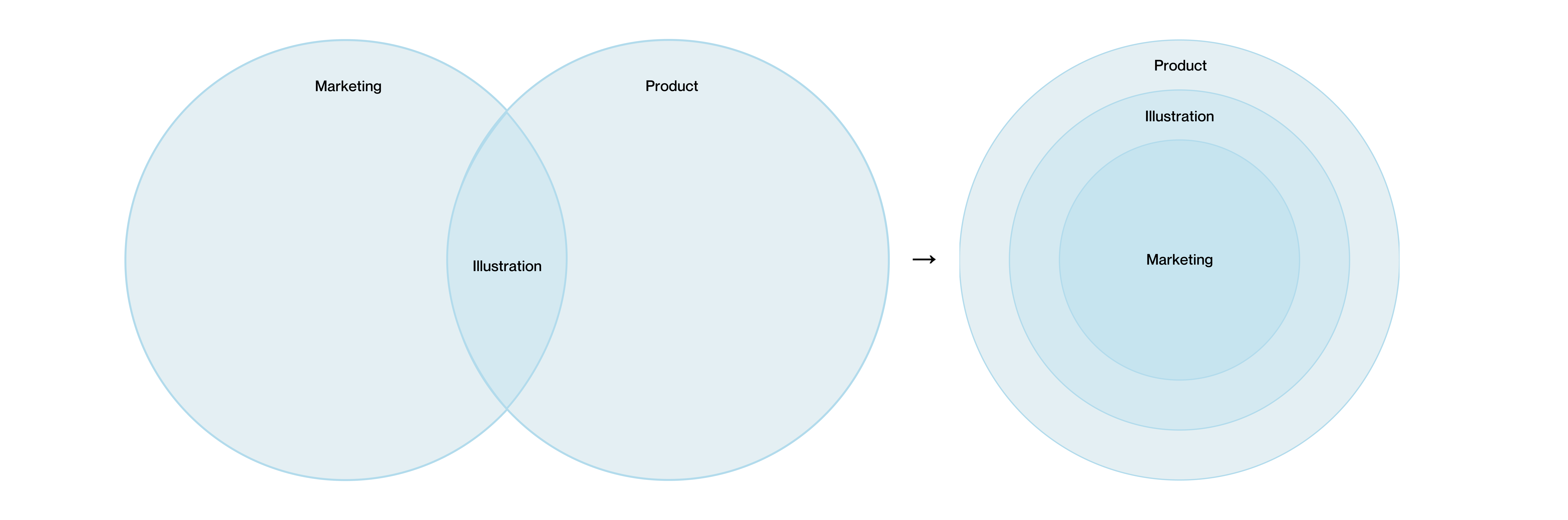
Give marketing and product a single palette to work from, instead of parallel versions of “Well blue.”

Accessibility by design

Make it hard to pick illegal pairs by tying contrast rules to tokens and roles, not one-off hex values.

Functional consistency

Keep “what this color means” the same across platforms, so buttons, alerts, and states read the same everywhere.

Scalable flexibility

Bake the rules into tokens, components, and docs so new work inherits them instead of reinventing them.

2.3.0 Defining direction

Exploration focused on balancing expressiveness, consistency, and scalability across use cases.

2.3.1 Direction

HMW.01

How might we streamline the color system so designers and engineers make confident, faster decisions?

HMW.02

How might we reduce complexity while keeping the system flexible enough to evolve?

HMW.03

How might we preserve the expressiveness of marketing and illustration colors without overcomplicating product design?

HMW.05

How might we unify fragmented palettes into a single, scalable system across platforms?

HMW.07

How might we ensure accessibility standards enable creativity rather than constrain it?

2.4.0 Bringing the system to life Pt.1

Previously, marketing, illustration, and product relied on separate palettes with shared colors, leading to inconsistent usage and limited scalability. The new structure unified these palettes into a layered system, allowing expressive brand moments while maintaining consistency and accessibility. This approach balanced flexibility with predictability, enabling color to scale across platforms, use cases, and future product needs.

2.4.1 Revamped color structure

Before: Marketing and Product palettes as overlapping circles with Illustration in the overlap. After: concentric circles from Product outer ring to Marketing center, showing a layered palette system.
Venn diagram: Marketing and Product circles overlapping; Illustration in the intersection. Concentric circles: Product outer ring, Illustration middle, Marketing center.

2.5.0 Puniform

2.6.0 Bringing the system to life Pt.2

Perceptual uniformity

Building a perceptually uniform color foundation

I rebuilt the color scales using perceptual uniformity to ensure consistent visual progression across states, themes, and platforms. This allowed color to behave predictably regardless of context, reducing ambiguity in design decisions while supporting accessibility requirements.

By grounding color values in human perception rather than traditional color models, each step became intentional and consistent. This created a reliable foundation for semantic tokens and reinforced visual hierarchy across the system.

2.6.1 Primitive tokens

navy

navy 99
95
90
80
70
60
50
40
30
20
15
10
05

neutral

neutral 99
95
90
80
70
60
50
40
30
20
15
10
05

pink

pink 99
95
90
80
70
60
50
40
30
20
15
10
05

indigo

indigo 99
95
90
80
70
60
50
40
30
20
15
10
05

blue

blue 99
95
90
80
70
60
50
40
30
20
15
10
05

leaf

leaf 99
95
90
80
70
60
50
40
30
20
15
10
05

yellow

yellow 99
95
90
80
70
60
50
40
30
20
15
10
05

orange

orange 99
95
90
80
70
60
50
40
30
20
15
10
05

red

red 99
95
90
80
70
60
50
40
30
20
15
10
05

2.7.0 Bringing the system to life Pt.3

Using Material Design as the structural backbone

I adopted Material Design as the structural backbone for the system reset. Its principles around hierarchy, accessibility, and scalable patterns provided a proven foundation and accelerated cross-team alignment.

3.0.0 Impact

Two designers on a 3-platform health DS. I owned color and Android's light theme.

18 component families

Documented across iOS, Web, and Android in a single source of truth — no per-platform forks.

5 of 18 certified token-clean

Buttons, Cards, List Items, Layouts, Shapes. The remaining 13 have named owners and remediation plans.

3-layer token architecture

16 semantic color tokens and 11 type styles mapped 1:1 across Swift, CSS, and Kotlin.

4 Figma decisions closed

Resolved in a single review cycle — unblocking 13 downstream backport issues and shrinking the open-foundation list from 6 to 2.

Android ~80% token compliance

Web ~35%, iOS ~18%. Measurable, dated, and surfaced on a dashboard — not living in a designer's head.

3.1.0 Learnings

A few things I’ll carry into the next system.

L.01

"Inconsistent" turned out to mean two very different things.

The audit started as one pile of 220 violations. It split cleanly into two: things that should be tokenized but aren't (backport work) and things that were intentionally bespoke and shouldn’t be tokenized at all (marketing blue, konfetti palettes, display fonts, missing-value sentinels). The system got more honest once bespoke had its own lane instead of being treated as debt. Six bespoke patterns are now governed, not hidden.

L.02

The real blocker wasn’t tokens — it was unowned decisions.

Four Figma decisions had been quietly blocking 13 downstream issues for months. None of them were technically hard. They sat because no one had explicit authority to ship a token name. Making ownership visible — with a simple log of priority, owning team, accepted date, and unblock count — moved work faster than any individual component spec.

L.03

Backport work isn’t the same as a migration, and the platform you assume is leading might not be.

Android, the platform with the smallest codebase and tightest M3 alignment, was already ~80% clean. iOS, the one we treat as the reference platform, was the furthest behind at ~18%. Writing down per-platform progress made it obvious where we actually were, instead of relying on whoever spoke loudest.

L.04

Cross-platform parity is a documentation surface, not an engineering one.

The type scale diverged on two axes: names and values. What iOS and Android call text-label-1 at 12px, web calls Typography.label1 at 14px — different name, different number, no obvious bridge. Component reach diverges on top: Android's button label pulls wellH4, iOS/Web pulls title5. You can’t patch your way out of that in code alone — you have to describe it clearly enough that no one reaches for the wrong style by accident.

L.05

Docs-as-app beats docs-as-wiki.

Earlier passes lived as Markdown and Figma comments and went stale in a week. Rebuilding the docs as a small Next.js app — with the audit data, decision log, and SDUI fixtures as typed sources — turned the site into the primary work surface. Updating a review updates the badge on the index page in the same commit.

L.06

One designer can’t ship a design system alone. They can ship the receipts that make it hard to ignore.

This wasn’t a “build a DS for a new product” project — it was excavation work on a 7-year-old codebase. The artifact’s job wasn’t to prove a system exists. It was to make the gaps so clear that closing them felt like the natural next sprint.